A Handy Guide to Optimizing Your Website for Mobile Devices

Table of Contents
- 5 Essential Benefits of Mobile Optimization
- 8 Tips for Optimizing Your Website for Mobile Devices
- Mobile Optimization Best Practices
- Key Takeaways
- Conclusion
- FAQs
Mobile optimization is the practice of ensuring users have the best possible experience when they access your website. A dedicated mobile website that is dynamically designed for a smartphone or tablet is recognized should provide this user-friendly interface. Optimizing your website for mobile devices should be your topmost priority if you want to attract more traffic to it.
A flexible website design may modify website products to make them mobile-friendly constantly. In other words, mobile optimization is a thorough examination of all aspects of a website, done to ensure mobile users have a good experience surfing it. To attract smartphone site users effectively, you must optimize everything from the appearance of the website to the page performance. Below, find out relevant information on how to optimize a website for mobile.
5 Essential Benefits of Mobile Optimization
Let’s analyze a few cores benefits mobile optimization offers.
1. Enhanced user experience
It is no secret that enhancing user experience is key to business success. And one of the most effective ways to do so is through a mobile-optimized website. There are plenty of ways in which you can boost user experience on a mobile-optimized website, including catchy calls to action (CTA), hamburger menus, responsive web design, simple forms, and much more.
2. Information that can be consumed on the move
It’s all about time, just like anything else on the internet. You have a few seconds to grab a website user’s attention. It is especially true for portable devices, considering that people view your business while on the move. You have a better chance of turning visitors into customers if they traverse mobile-friendly material present on your site.
3. Faster load time
In the digital world of today, time is of the essence, and so is speed. A standard webpage that isn’t compatible with mobile devices may load exceptionally slowly, or, in the worst-case situation, won’t load at all on a smartphone. However, if the website is designed to be mobile-responsive, it will respond rapidly, even on smartphones.
4. Higher search rankings
Whether we like it or not, we are all slaves to search engines when starting a business. So in order to rank high on search engine results pages (SERP), we typically execute whatever Google advises, be it link building or creating quality content.
Google recommends that administrators make their websites accessible and more usable for mobile users. Therefore, optimizing your website for mobile devices will improve its chances of ranking highly in Google’s search results.
5. Advantage over competitors
Another key benefit of optimizing your website for mobile devices is that it helps you gain a competitive advantage over your rivals. As of the fourth quarter of 2021, mobile phones generated 54% of the global website traffic. Therefore, if your website is not optimized for mobile, you are surely missing out.

8 Tips for Optimizing Your Website for Mobile Devices
When it comes to mobile optimization, there are several factors to take into account. Mobile-friendliness is a vital design element, so you must consider the overall user experience. Here are eight recommendations for optimizing your website for a mobile device.
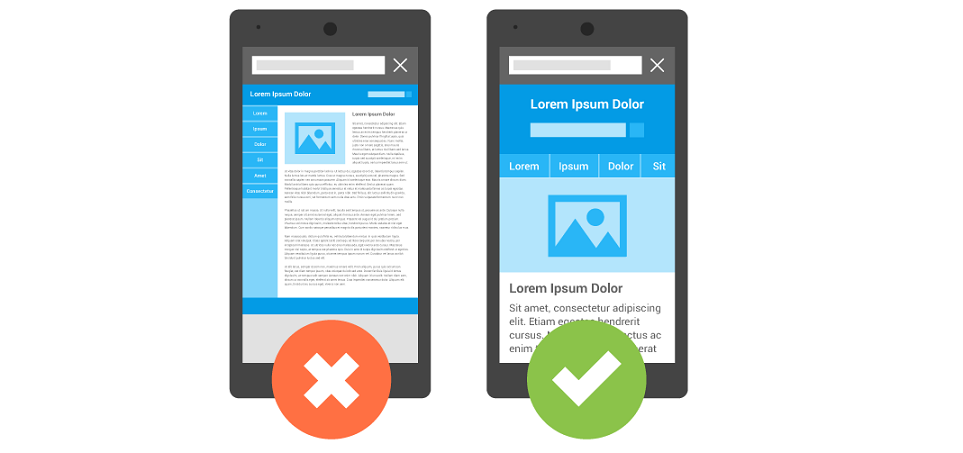
1. Use responsive design
One of the more recent approaches to site design is responsive design. The term “responsive” refers to how a web page adjusts the size and arrangement of its information to match the device on which it is being viewed. This method frequently improves user engagement and increases search engine marketing effectiveness.
An adaptable design ensures that your website is designed optimally and functions effectively on all devices. It should be easily scrollable and read if visitors change the direction of their equipment (portrait vs. panorama) or change their operating choices to utilize larger font sizes.
2. Make the navigation menu more user-friendly
If you’ve improved your website’s drop-down menu, you’re on the correct course. On the other hand, mobile monitors are much shorter than desktop and notebook computer monitors. Consequently, it is suggested that the navigation menu be simplified and made relatively straightforward.
The hamburger menu has grown in popularity across mobile internet adaptations. This navigation occupies less display space, while still ensuring that the menu options can be found and picked quickly.
3. Consider the size of the smartphone
When it comes to creating a web page for a desktop site, you have a lot more flexibility regarding where components might go. However, there are several restrictions on portable devices that you might not have anticipated at first.
For instance, the way users handle their smartphones might affect how much of the display is widely obtainable, affecting their engagement with the website. Understanding your users’ range of motion will help you arrange clickable information in more accessible parts of the screen.
4. Ease the process of form-filling
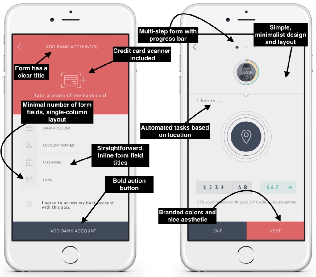
Because smartphones make it much harder to fill out forms than desktops and laptops, it’s a good idea to keep the number of contact fields you ask visitors to fill out to a minimum. Ensure you keep only the essential questions, and consider decreasing the size of textboxes. In essence, your mobile form design should be extremely functional and convenient to use.
5. Select an optimum size and location for the CTA
On a website, display ads and interactive components are critical for navigating the website and learning a little about what the firm has to offer. When it comes to CTAs on handheld phones, it is also crucial to consider the buttons’ size, how far away each key is from one another, and where they’re placed on the display.
6. Remove pop-ups
You have almost certainly seen a few unclosable pop-ups when browsing a web page on your smartphone. Pop-ups are incredibly annoying to users, and the harder they are to shut down, the more likely it is for people to abandon the website. When it comes to pop-ups on mobile devices, the best strategy is to eliminate them as much as possible. This includes any unwanted promotions, advertisements, or other pop-ups users may get.
7. Increase page speed
Although it may seem self-evident that sluggish websites are detrimental to search performance and customer engagement, it’s important to keep reminding yourself of it from time to time. In most circumstances, the speed of your desktop version will be different from the performance of your mobile browser. Using some online tools, you can receive an assessment of the amount of time it takes for your website content to load across devices.
8. Optimize your images
Illustrations are the most prominent cause of mobile websites taking longer to load. Your web page’s SEO, ratings, and consumer experience will all benefit from properly optimizing your visual (even for computer readers).
Mobile Optimization Best Practices
By now, you must be familiar with the benefits of optimizing your website for mobile devices. You are also armed with key tips on how to optimize websites for mobile devices. Below, we give you some industry best practices related to mobile optimization.
1. Don’t say goodbye to the fold yet
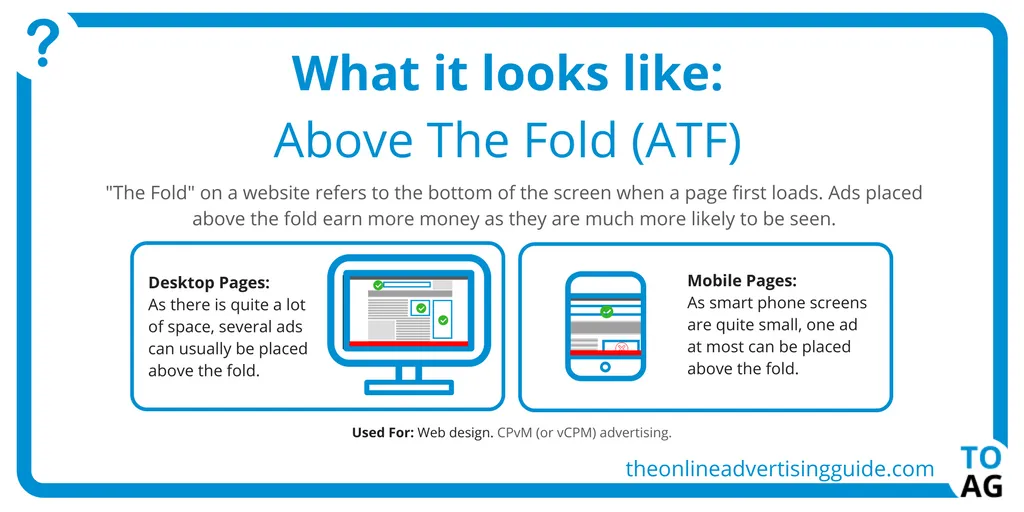
It’s critical to understand that matter above the divide isn’t completely gone in a virtualized context, where items scroll continuously. Therefore, it’s advisable to get at least a little textual information well above the fold to indicate that there’s a cause to descend.
2. Make use of responsive design methodologies
Multiple m-dot webpages (m.example.com) are no longer necessary. There is no justification for using such an approach in the mobile-first age. A responsive design is when the layout and all the contents on the web page adjust and reorient themselves according to the size of the device they are viewed on.
3. Don’t just concentrate on the mobile user
The interests and ambitions of users across channels are merging. When you concentrate on what each user seeks to accomplish based on platforms, you can develop a more holistic strategy for reaching clients through your business.
4. Look for flaws in your design and correct them
Site speed isn’t always a sign of insecurity. However, it can indicate flaws with the implementations across various screens and systems. Take the time to analyze other such elements of your site and fix the caveats.
5. Use WordPress plugins for more mobile-friendliness
There are several WordPress plugins available, and many are built to enhance the user experience. These plugins help improve the overall navigability of your website while keeping the users engaged.
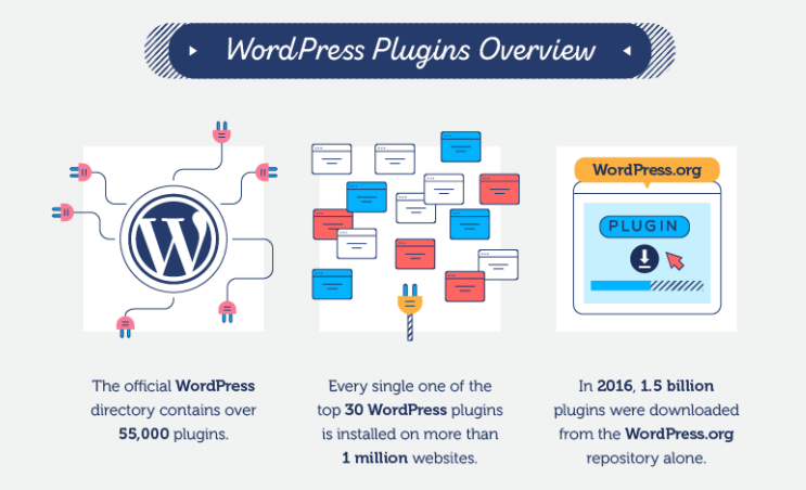
WordPress add-ons do a wonderful job of boosting your site’s overall performance. From automatic compression of images to smooth animation support and lazy loading, they help you optimize your mobile website in more ways than one.
6. Avoid using intrusive ads to position your business
It’s possible that the product you’re selling is the best. It is also possible that you craft great ad copy. However, contextual ads blocking the reader’s view of the actual content are a recipe for disaster. Wherever possible, limit the usage of ads. Where absolutely necessary, ensure the ads are shifted to a corner and give the reader the option to remove them.
7. Don’t use Flash video
Avoiding Flash should be a standard procedure in this day and age, yet, you may see it on websites. Flash films became extinct ever since Adobe stopped supporting them, clearing the way for HTML 5 streaming.
8. Make sure the content is uniform across all devices
This is one of the most important rules when it comes to optimizing websites for mobile. Be it a tablet, laptop, or mobile, the information you give out needs to be uniform. Along with making this clearer for the reader, it also helps build brand identity.
Key Takeaways
- Because web users prefer smartphones to desktop computers, you must thoroughly examine how your webpage functions and appears on smaller displays.
- If you don’t want to be punished by search engines, you should optimize your site to work effectively on portable devices.
- A webpage that has been customized for portable devices reformats automatically. This ensures that the site displays appropriately on smaller devices, making it a lot easier to browse.
- Mobile optimization is the need of the hour, as it leads to higher search rankings and faster load times.
Conclusion
We currently exist in a world that is dominated by mobile devices. In addition, since more and more individuals are using their portable devices to view and surf websites, you definitely do not want to be left behind. So get cracking, and bear the fruit of optimizing your website for mobile devices.
FAQs
Mobile optimization is a term that refers to the process of ensuring that users who contact your site via handheld devices enjoy an encounter that is customized for the platform.
While mobile-responsiveness aims at enhancing the user experience for mobile users, responsive design entails optimizing content across devices.
Website optimization technologies allow you to collect data on how visitors interact with your site. They help you gain crucial insights into your site’s performance.
Optimization aims to develop the “optimal” design possible based on a set of prioritized criteria or restrictions. This includes increasing the production, strength, dependability, lifespan, and effectiveness of the content, among other things.
Information that can be consumed on the move, faster load times, higher search engine rankings, and an enhanced user experience are some of the many benefits of having a mobile-friendly website.
Latest Blogs
Explore how Google’s 2025 AI search updates triggered ranking chaos. Learn actionable strategies to adapt your SEO for AI Overviews, zero-click searches, and SERP volatility. Stay ahead now.
Learn how to rank on AI search engines like ChatGPT, Perplexity, and Gemini by optimizing your content for authority, structure, and relevance. Stay ahead in AI-driven search with this strategic guide.
Explore the best healthcare SEO services for your medical practice. Improve online visibility and effectively reach more patients in need of your services.
Get your hands on the latest news!

Similar Posts

B2C Marketing
5 mins read
Top Choices for Best Content Marketing Services in B2B Industries

Artificial Intelligence
5 mins read
How A Lead Generation Specialist Can Use AI-Powered Content Funnels to Drive Conversions

Artificial Intelligence
4 mins read