The Importance of a Google Mobile-Friendly Website?
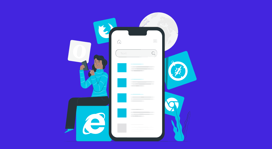
Table of Contents
- The Importance of a Google Mobile Friendly Website?
- How to Create a Google Mobile Friendly Website?
- Conclusion
- FAQs
Today, digital marketing is the most important tool for growing your business. After all, everyone you know is surfing the Internet at least once a day. And no prizes for guessing what device is used most for that. While laptops and computers are mostly used for business purposes, mobile phones are used all the time. So, it isn’t surprising that internet traffic is mostly coming from mobiles. Hence, it’s crucial that you have a Google mobile-friendly website.

The Importance of a Google Mobile Friendly Website?
You already know that Google is the most used search engine globally. To top this list, it has surpassed Yahoo, Bing, and the rest. In fact, it is the most visited website in the world. Google has over 8.5 billion searches conducted daily. Therefore, it’s no rocket science that assessing and understanding Google’s search trends will improve your websites’ conversion rates. Moreover, 63% of the searches on Google are conducted from mobile phones.

It’s a given that you would want your website to have a large reach. Search Engine Optimization (SEO) is a crucial part of this marketing. When optimizing your website, you improve its Search Engine Result Page (SERP) ranking. This means when somebody searches for something on Google that’s even remotely related to your business, your website will show up in the initial results. As a result, you’ll be able to convert more potential customers.
A mobile friendly experience
Let’s come to the ‘mobile-friendly’ bit of the equation. Did you know that more than half of the global web traffic comes from mobile phones? And so, Google now focuses on mobile-friendly website optimization.
They say that your website’s mobile page load speed is vital in determining its search result ranking. That means, if your mobile site takes a lot of time to load, the chances are that your website will get minimum visibility in Google’s search results. We all know how dangerous that is for your lead conversion. All the statistics mentioned earlier prove the importance of being a Google mobile-friendly website.
In addition, what your website looks like on mobile phones, whether the text is legible, the pictures too big, etc., are additional elements that need your attention. The moment this goes out of whack, you’ll begin losing the audience.
Plus, you will need to ensure that it is easy to navigate through your mobile site. If you add inconvenient steps to the process, your viewers will get frustrated and bounce off.

How to Create a Google Mobile-Friendly Site?
Thankfully, Google has always been helping us out in this aspect. It releases a set of guidelines that’ll assist you in achieving your desired goals. If, however, your website requires too much work to become a Google mobile-friendly website, you might need a web developer. Following are some ways to improve your viewers’ experience when using your mobile site.
Add the requisite information
Make a note of all the information that your potential clients may need. You may follow all the SEO guidelines, like writing SEO articles, to increase your website’s viewership, but if it fails to provide appropriate information to the customers, it’ll all go in vain. In addition to this, add basic and easy-to-understand tabs. This helps with smooth navigation, resulting in a fulfilled experience.
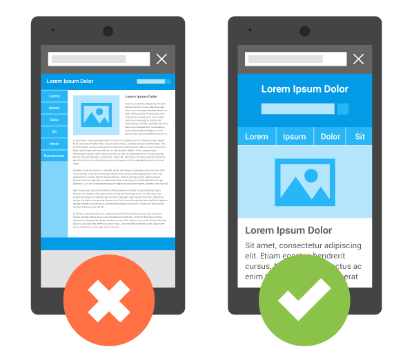
Make a responsive website
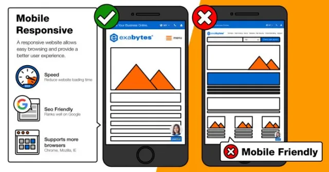
When your potential customers visit your website from their phones, you want them to see a properly designed site to fit their phone screens. That’s what makes a ‘responsive website’ means. By doing this, your website will automatically adapt itself to the size of different screens.
Check the size of all the website elements
What if the banners on your mobile website are big enough to fit a computer screen properly? You’ll have big text that’ll cut from all sides, along with zoomed-in pictures and huge CTA buttons. No customer wants such an experience. As a matter of fact, with all the newfound convenience, the users’ patience level has decreased in this regard. Therefore, if you ignore the size of your site elements, the chances are that your users will leave your website frustrated and never return.
Say no to heavy high-quality pictures
High-quality pictures are always heavy, so much that adding them increases the website’s loading time. This again takes us back to the users’ patience level. Furthermore, you may still find poor internet connectivity in a lot of places.
When that happens, sites with heavy images tend to show an empty gray box in place of the image that couldn’t load. Thus, it’s better to compress all your images not to keep your customers waiting.
In the end, you will always have Google by your side to make a Google mobile-friendly website. Feel free to go through the suggestions shared by Google here.
Conclusion
With competition always on the rise, every website owner must give their website that extra edge. But before that, don’t forget the basics. With the large number of people surfing the internet on their mobiles, having a Google mobile-friendly website is a basic requirement. So, follow the aforementioned steps and get ready to convert good leads.
FAQs
Traffic on the internet majorly comes from mobile phones. And, 94% of all the organic traffic comes from Google. This is why Google focuses on websites’ mobile-friendly optimization. When you optimize your website’s content to be more mobile-friendly, it will rank higher in Google’s search results whenever your potential clients search for keywords that you optimize your website for.
Being mobile-friendly matters for a website’s SEO since most search engines favor mobile-friendly sites. So, if your website is optimized for mobiles, it will get better visibility and show up before the others in search results.
A mobile-friendly website is one that can be used in the same manner as a computer site. It is designed in a way that the elements fit rightly into the screen of a mobile or tab.
Yes, Google has been following mobile-first indexing for some years now. Mobile-first indexing means that if your website has a separate URL for desktop and mobile sites, then Google will index your mobile site URL. Google will, thus, show your mobile URL to mobile users and desktop URL to the rest.
Website design directly affects your website’s search rankings. If your website is designed in a manner that is inconvenient for users, then your website will show up much lower in search results than others.
Latest Blogs
Explore how Google’s 2025 AI search updates triggered ranking chaos. Learn actionable strategies to adapt your SEO for AI Overviews, zero-click searches, and SERP volatility. Stay ahead now.
Learn how to rank on AI search engines like ChatGPT, Perplexity, and Gemini by optimizing your content for authority, structure, and relevance. Stay ahead in AI-driven search with this strategic guide.
Explore the best healthcare SEO services for your medical practice. Improve online visibility and effectively reach more patients in need of your services.
Get your hands on the latest news!

Similar Posts

B2C Marketing
5 mins read
Top Choices for Best Content Marketing Services in B2B Industries

Artificial Intelligence
5 mins read
How A Lead Generation Specialist Can Use AI-Powered Content Funnels to Drive Conversions

Artificial Intelligence
4 mins read