10 Tips To Summarize Information For Presentation

Table of Contents
- Introduction
- 10 Best Presentation Slide Design Tips
- Key Takeaways
- Conclusion
- FAQs
Let us all admit, designing and presenting a PowerPoint Presentation is a dicey, tedious task that you either hit or miss totally. However, as discussed in this article, knowing some smart tips and tricks can save you from boardroom mishaps!

10 Best Presentation Slide Design Tips
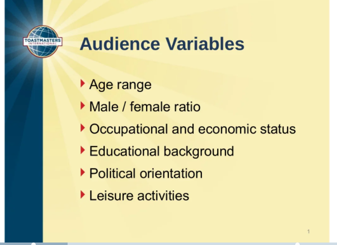
1. Identify your audience
The first essential step in designing an effective presentation is to know your audience. The content of your presentation should be largely inspired by and based on the nature and composition of your target audience.
I clearly remember an incident where a colleague of mine presented some extremely technical financial information to an audience that was barely into finance. The result was he received extremely negative feedback even though his facts and technical presentation were bang-on!
For example, if you are delivering a presentation on mutual funds and your audience is mostly women who have not handled personal finances in their life, you should rid your presentation of all technical jargon and case-based scenarios that the audience can not connect with.
Thus, it is pertinent to know the gender composition, the age mix, the educational background, the regional orientation, the likes and preferences, and other related factors of the target audience to cater to the needs better.
2. Focus on design and layout
After you have successfully identified the target audience, the next best practice for PowerPoint design is to chalk out the layout of your presentation. You need to keep certain factors in mind when it comes to design and layout; the color palette, the text font, the font size, the contrast, the background, etc.
While delivering a corporate presentation, neutral color such as a shade of gray or blue is picked up for a more professional finish. If the presentation is text-intensive, the background is kept neutral and fading.
We all remember such embarrassing moments from our college days. We were all beginners at designing and presenting PowerPoint presentations, and we messed up with the presentation’s formatting. From wrong font size to going overboard with PowerPoint visual effects. We have realized the hard way that less is more when it comes to a presentation!
You should always try to be minimalistic when using color shades; a maximum of two colors should be used in a presentation.

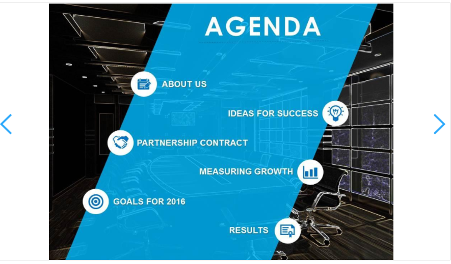
3. Mention the agenda
The first slide of your presentation should define all points that will be covered in your presentation. It should give a general overview and understanding of the topic being addressed by the presenter.
For example, if you are delivering a presentation on rising cases of cybersecurity issues, your agenda should be defined as A) What is a cybersecurity threat? B) Summarized comparison of rising in cybersecurity threats over the years. C) Approach towards tackling such issues D) Solution if you encounter a Cybersecurity threat E) Conclusion F) Way ahead.
The last slide should, of course, be a thank-you slide for your audience for being patient.
4. Less text, more impact
Believe us when we say this, as an audience, we all hate being bombarded with a lot of text to read on screen, so why serve it when you are the presenter? You should serve the least information via simple plain texts.
While you must give as much information as you can, you still need to be compact and precise. The best way to do this is to give only pointers/headings in your presentation and let the detailed information be conveyed orally while presenting.
Too much text will fail to retain the interest of the audience. Moreover, if it is a technical presentation, you need to avoid unnecessary text in your PowerPoint presentation.
You also need to remove redundancy and ensure that you are painting a complete picture in the as minimal text as possible while keeping the audience engaged.
For example, while giving a presentation on Mutual Funds, you can put the types of mutual funds, i.e., debt and equity, in your slide as a pointer and give detailed textual information orally to your audience while explaining the same.
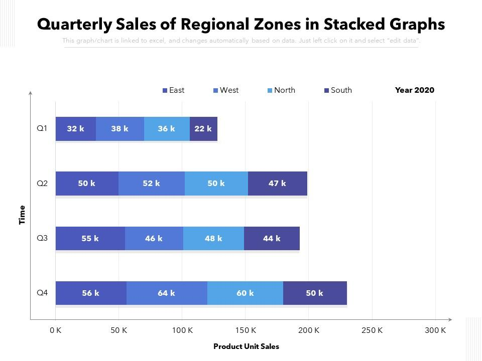
5. Use of charts and graphs
A presentation flooded with raw data and nothing eye-catchy will fail miserably to keep the audience engaged. Charts and graphs come to your rescue when your presentation is data intensive. Data, if presented in the raw form, fails to develop and sustain the target audience’s interest.
Let us say you are presenting before the head of sales department with the data on monthly sales of a product, region wise. There are 12 months and 20 regions for which you must display the data most comprehensively. A tabular representation will be okay until multiple locations and multiple period data are not involved. Post that, tabular data is an eyesore, and graphical representation is more appropriate.
The top management generally runs short of time and is keen on getting summarized information; use graphs and charts to summarize your data and give full yet concise information in a simplified manner.
6. Structuring information
The flow of data across all slides should be smooth, and the transitions should be cohesive. Consistency is the key. You should not bombard the audience with a lot of data at the beginning of the slide or towards the end of the presentation.
There should be adequate pauses, breaks, and gaps in the data flow. Too much information is hard to process in a short span; hence, you should aim at structuring the entire information in such a manner so that the core message of your presentation reaches the audience.
Enough emphasis and time should be given to each slide of your presentation. You should have a key message at the end of each slide that briefly summarises the agenda of that particular slide so that the audience remembers and recollects all the information when needed.
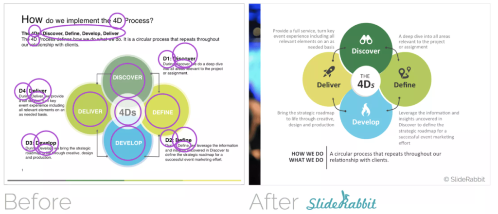
7. Pictorial representations
A picture speaks a thousand words, and at the same time, it also helps you in avoiding a data-heavy presentation.
Pictorial representation of data is the most convenient and articulate way to deliver the desired information smartly.
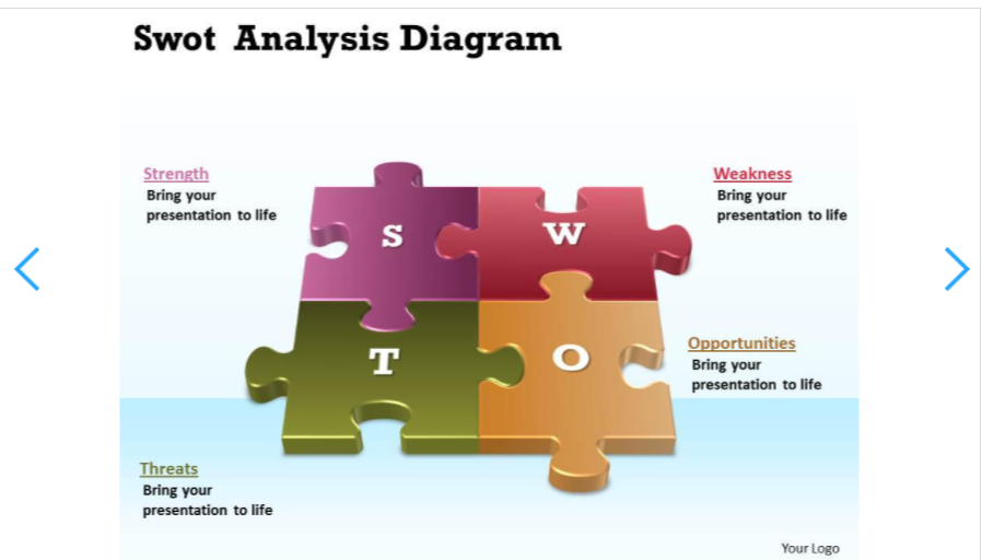
For example, if you are explaining SWOT Analysis in your presentation, it is always advisable to use pictures rather than going for textual representation in the form of bullet points. A plain-text reading of what SWOT stands for is not pleasing to the eye. It is also less impactful when compared to a pictorial representation.
Maintaining a balance between textual and pictorial information should be maintained. Your audience should absorb the slides while still being attentive to what you are speaking.
8. Elimination to finalization
The moment you start gathering data for a presentation, you need to follow the elimination to finalization method. You need to jot down only the relevant points to be conveyed to the audience and chop off the remaining by editing the data.
For example, you must have gathered a lot of data relating to Mutual Funds but keeping in mind all the above points that we have discussed so far, you will have to edit and keep only the essential information in your presentation slides.
What to include in a presentation? Include all relevant data such as types of mutual funds, modes of investments, schemes of investments, expense ratios, Net Asset Value (NAV) and exclude redundant data, heavy data involving statistics, data involving specific fund performances.
A smart presentation should be an easily-digestible, soothing meal without a heavy concoction of disrupting elements.
9. Examples and quotations
Any PowerPoint presentation is incomplete if you do not include sufficient examples to make your audience understand your point in a better manner.
Continuing with our example of a PowerPoint presentation on mutual funds, if you are delivering a presentation before prospective investors, you need to quote some real-life examples that will win their trust with investing money. This can include the past performance of a fund, real-life calculations of a past investor, etc.
You need motivation as the driving factor behind encouraging your audience to invest; hence, you should be quoting biggies from the investing world like Warren Buffett to make a powerful impact on the minds of your target audience.
10. The slide is to time ratio
Time management is a crucial factor when we talk about Presentation design tips. As a rule of thumb, you should be dedicating a minute per slide of your presentation.
However, in practice, this may vary. Certain slides, such as a slide with a comprehensive example, will require more time to be explained to the audience.
For example, if you are delivering a 10-minute PowerPoint presentation of 10 slides, you should try to allocate a minute to each slide and nothing more. Of course, if the slide can be managed with less time than a minute, you should not stretch it any further.
Too much information in too little time is as lethal as no information.
Thus, you should try and maintain an optimum ratio as far as the time is taken to explain each slide is concerned.
Key Takeaways
- Before even assimilating information for your PowerPoint presentation, always know your target audience in advance. Doing this ensures that you eliminate unnecessary data at the inception and changes your outlook towards building a presentation.
- Once you have finalized details about the target audience, the next best practice is to design the PowerPoint Presentation per your audience’s mix. The color theme, background, use of objects is taken care of in this step. The format should be per the type of audience being addressed.
- The topic of discussion should be clear in your head and your presentation. You should lay down the plan clearly so that the audience knows the topics being covered for them. This helps in building a connection with the audience at the onset. While walking them through the agenda, you can briefly touch base on points included therein to give them an overview of what to expect from the PowerPoint presentation.
- Let’s reiterate the positive impact that the absence of more textual information has on a PowerPoint presentation. A heavy, data-loaded presentation is always difficult for the audience to comprehend. So, keep your textual information to the bare minimum so that it just serves the need without impacting audience engagement.
- If you remove textual information, what is the other way to present it? Well, it is through pictures, graphs, and charts. Studies show that audience engagement is higher when the presentation includes more graphical elements than basic textual information.
- A power-packed presentation sometimes may fail to deliver its objective if it is not well-structured. Your presentation should flow smoothly in a chronological manner, sensing your audience’s emotions.
- Pictorial representations are an extension of what we have discussed in including more graphical information. While graphical information comes to the rescue while presenting complex data in a simplified manner, pictorial representation helps in removing the monotony of plain texts. Including pictures more often keeps the audience engrossed in the message being conveyed.
- Sometimes, while assimilating information for your presentation, you will feel overwhelmed with the amount of data you gather. The best way to keep only relevant information is to edit and eliminate irrelevant data. Make sure you stick to the agenda of your presentation.
- Real-life examples are always motivating, and we all feel genuinely connected with them. Quoting unrealistic case scenarios will burden the audience with something they can’t resonate with. Hence, you should always quote and share real-life examples wherever possible. In your presentation, a little motivational quote or a famous quote that people are aware of, here and there, establishes an instant connection with the audience.
- Lastly, always try to adhere to the time slide ratio. Remember not to spend too much time explaining things that won’t matter much to the audience. Explain in detail but not in-depth.
Conclusion
To sum it up, these ten extremely helpful presentation design tips will help you navigate the process step by step and will aid you in delivering appropriate information in the most lucid presentable manner.
FAQs
Your presentation is the medium to provide information in an organized manner to the recipients seeking that information. If the design or format of the presentation is not comfortable for the audience, they will not be able to absorb the information at all.
Hence, it is important to design the presentation so that the audience gets influenced and digests every fact that is served via the presentation.
Be creative, but don’t go overboard with it. Try to keep it simple and pleasing to the eyes. Try not to implement each element that you know of while preparing a PowerPoint presentation. Use subtle colors and background so that it is pleasant in appearance.
While deciding the target audience and the plan, you will realize that your PowerPoint presentation must be any of the below-mentioned types:
Informative- Informative presentation is a presentation that intends to disseminate information to a group of people, such as a presentation on awareness on the spread of HIV.
Instructional– Instructional presentation is a type of presentation that intends to educate, teach, and induce people to follow a path such as a presentation on using MS Office.
Persuasive- Persuasive presentation is a kind of presentation that intends to induce a response from the audience, such as a presentation on Investing in Mutual Funds.
Decision-making: A kind of presentation that intends to support or drive a decision, such as a presentation on prospective product marketing areas, is known as a decision-making presentation.
Ensure there is enough empty space in your slides, and the text is clearly visible. Make sure you use variations in font size and not in font type. You should use a neutral color palette as background and contrast; your slides shouldn’t appear to be carved out of a rainbow!
As a thumb rule, we should be allocating nothing more than a minute to each slide. If any slide requires a detailed explanation, the time should be balanced accordingly.
The best way to structure or start structuring a presentation is by setting a defined agenda. Once you chalk out an agenda, start working on the structure of the presentation by keeping only that information that is essential.
It depends on the kind of presentation that you are presenting.
1. If it is an informative presentation, you can conclude by taking up queries and questions from the audience.
2. If it is instructional in nature, you can ask questions to the audience to get a better idea of their understanding.
3. If the presentation is persuasive or a decision-making presentation, you can conclude by reiterating the selling point of the presentation.
Latest Blogs
Explore how Google’s 2025 AI search updates triggered ranking chaos. Learn actionable strategies to adapt your SEO for AI Overviews, zero-click searches, and SERP volatility. Stay ahead now.
Learn how to rank on AI search engines like ChatGPT, Perplexity, and Gemini by optimizing your content for authority, structure, and relevance. Stay ahead in AI-driven search with this strategic guide.
Explore the best healthcare SEO services for your medical practice. Improve online visibility and effectively reach more patients in need of your services.
Get your hands on the latest news!

Similar Posts

B2C Marketing
5 mins read
Top Choices for Best Content Marketing Services in B2B Industries

Artificial Intelligence
5 mins read
How A Lead Generation Specialist Can Use AI-Powered Content Funnels to Drive Conversions

Artificial Intelligence
4 mins read