How to Optimize Your Website for Mobile: The Ultimate Guide

Table of Contents
- What Is Mobile Optimization?
- Why Is Mobile Optimization Important?
- How to Optimize Your Website for Mobile Devices
- Conclusion
- Key Takeaways
- FAQs
StatCounter revealed that in 2016, there were more mobile internet users than computer internet users. Statista added to this figure, revealing that in 2021, there were 4.32 billion mobile internet users.

This data shows that it is essential for your business to learn how to optimize your website for mobile devices. Also, Google now has a mobile-first indexing algorithm. This means, if you want to rank higher on Google, you will need a mobile-friendly website. In this blog, we examine some key elements that make a website mobile-friendly.
What Is Mobile Optimization?
Mobile optimization is the process of tweaking your website so that it delivers a great user experience when viewed on a mobile phone. Mobile phones are different from personal desktops. They have different screen sizes. This is why websites must be laid out differently to be experienced in the best possible way on mobile.
Design elements need to be rearranged so that a mobile internet user gets an optimal experience of the website. The user should be able to view pictures, text, menus, and other website elements without a problem. The process of ensuring this is called mobile optimization.
Mobile-friendly websites are different from responsive websites. Put simply, mobile-friendly websites “show” the same information from desktop to mobile. Responsive websites, on the other hand, let the user “experience” the same information. Mobile-friendly websites are designed for mobile screens. Responsive websites are designed to fit all screen sizes.

Why Is Mobile Optimization Important?
Mobile optimization is important for the following three reasons.
1. Ensuring customer satisfaction
Many customers view websites through a mobile device. Making sure they have a positive user experience ensures that they leave the site with a good impression of your brand.
2. Building brand value
To improve brand value and enhance goodwill, a positive online experience for customers is essential. A negative mobile browsing experience harms brand value, while a positive experience lets your brand stay on in the minds of users.
3. SEO benefits
Optimizing your website for mobile offers significant SEO benefits. Ranking higher on Google is not only important for your bottom line, but it is also the key to unlocking your company’s online potential.
How to Optimize Your Website for Mobile Devices
This mobile-friendly website guide shows you 14 steps to creating a mobile-friendly website.
1. Choose the right theme on WordPress
If you are using WordPress like over 40% of websites do, a mobile-friendly website can be as simple as choosing the right theme. Some themes come mobile-optimized. Search for responsive themes from your WordPress dashboard under Appearance>Themes. Ensure your content looks great on every device. To be doubly sure, also go through the other steps listed below.
2. Make your website forms short
Your website may feature one or more forms. Don’t ask for a lot of information from users: keep your forms as short as possible. Mobile users find it difficult to fill in lengthy forms. An email list subscribe form shouldn’t ask for home addresses. Likewise, the checkout form should be simple and uncomplicated.
3. Incorporate the search function
Adding the search function to your mobile website reduces user reliance on menus. For large sites, it is imperative to feature a search box. Doing so enables users to find exactly what they are looking for, and fast. A large, complicated list of menu options can kill conversions.
4. Enlarge clickable elements
It is easy to click on pictures, buttons, and other elements when using a mouse with your PC. On mobile screens, however, things are different. Clickable elements need to be large so that users can click on them in one go. Not having this means frustration and a bad user experience.
5. Keep the text short and sweet
Avoid the “great wall of text.” You need to communicate your message completely but do it simply. Stay away from the complicated and wordy text. This appears bulky and is not user-friendly. Ask yourself the following questions.
- Is the visual hierarchy good?
- Is the message being communicated well?
- Is there enough customer focus due to the design elements?
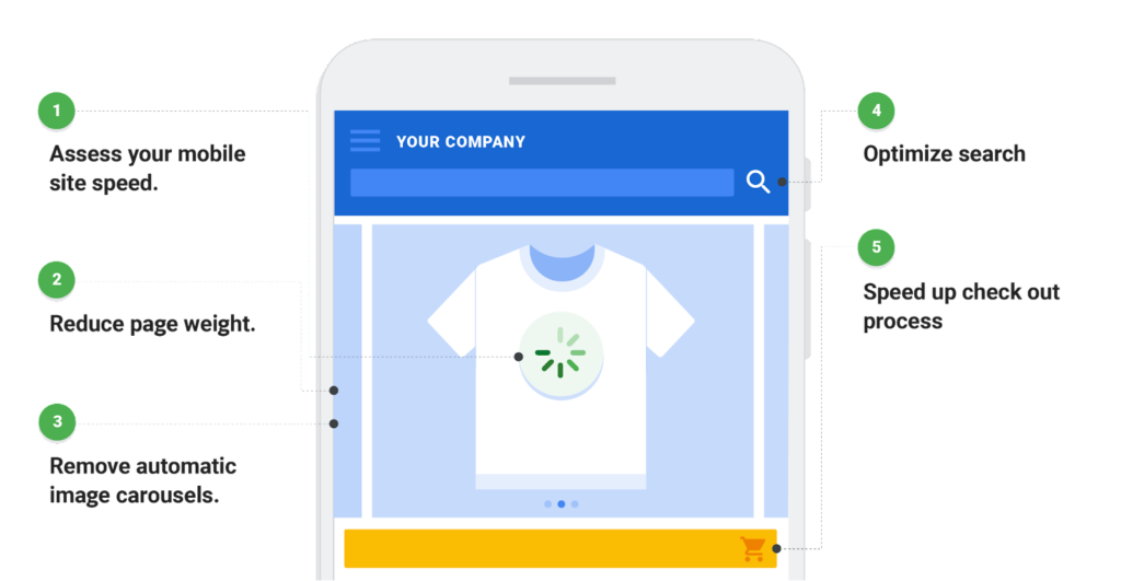
6. Speed up your website
There are several things to do to speed up your website. These include setting up a content delivery network (CDN). On WordPress, there are plugins to speed up your website. Experienced developers have several tricks up their sleeves to increase the speed of a website. PageSpeed Insights from Google lets you know what you need to do to speed up your site. Simplifying your design and avoiding unnecessary images and elements is a good place to start.
7. Media queries are key to responsive design
Some sites don’t just resize, but also reshape. Elements move together, getting wider or thinner than before. This is due to media queries that make the site responsive. Media queries are essentially a CSS feature that lets your site reorient itself to various web conditions. They are the ultimate solution to responsive sites.
8. Optimize the menu

Although PC-viewed website menus can be complicated, they can’t be implemented as they are on mobile devices. When working on how to optimize your website for mobile devices, remember to make user navigation easy through optimized menus. Sidebar menus are useless on mobile devices.
9. Display calls to action clearly
Remember, your site is created for a purpose. Fulfill that purpose by clearly displaying your calls to action (CTA). Depending on the primary goal of a page, pair it with an appropriate CTA. Don’t have more than one CTA on a page. Your user should be able to spot the CTA in a second or two.
10. Customer service should be easy to access
Your customer service information should be easily accessible. If a disgruntled customer can’t find your customer service page, it may lead to them being frustrated. Customer service is key to a good product experience and should be easy to locate for mobile users.
11. Get rid of mobile popups
Popups are a nuisance for mobile users, far more than they are for website users. The reason is that they are distracting and are difficult to close. The “close” button is so small on mobiles that it may take a few taps to just get rid of the popup. The solution, therefore, is to do away with them on mobile devices completely.
12. Use the correct fonts for readability
Some fonts go well together. They look good in combination and enhance readability. Choosing the right font combinations is more crucial on mobile than on desktops. They can mean the difference between a winning website and a loser one.
13. Define widths in percentages
HTML elements are assigned widths. Widths can be in absolute values or in terms of percentages. When widths are defined in absolute values, they do not change in size on different screens. One of the keys to a mobile-responsive website is to define widths in terms of percentages.
14. Use accelerated mobile pages
Accelerated mobile pages (AMP) are HTML pages that follow a particular format. These pages are prioritized by search engines for certain queries. They load fast on mobiles. When studying how to optimize your website for mobile devices, make sure you implement this format. For WordPress users, there is an AMP plugin that makes this job easy.
Conclusion
Mobile optimization is a necessity in today’s fast-changing online world. If you haven’t optimized your website for mobile, it means you are not current. This also means lost traffic. To get started, you need to first study how to optimize your website for mobile. Then, implement your learnings prudently. By ensuring a good experience for mobile viewers, you will maximize conversions and build a strong brand for this growing segment of online users.
Key Takeaways
- Mobile website needs are different from desktop ones.
- What works well for desktop sites might not work well for mobile sites.
- Mobile usage is growing exponentially, and there are already more mobile internet users than desktop ones.
- To optimize your website for mobile, follow the 14 points listed in this mobile-friendly website guide.
- Mobile optimization is a conscious choice, and has to be implemented scientifically.
- Although mobile optimization is technical, it is not overly complicated.
FAQs
Yes. A mobile-optimized site ranks higher on search engines. If users can transact on their hand-held devices, it increases conversions.
Tools such as Pingdom, Google PageSpeed Insights, and GTmetrix let you know your website speed, along with guiding you on how to optimize your website for mobile, speed-wise.
A mobile-optimized website has several advantages. Perhaps the most significant one is that it gives mobile users a great experience when browsing the site on mobile.
Follow the 14 steps mentioned in this mobile-friendly website guide diligently, and you will be able to optimize your site for mobile.
Mobile searches feature local searches more prominently. Domains with local intent are given prominence in mobile search.
A web host is extremely important. There is a big difference in website loading times depending on the host.
Latest Blogs
Explore how Google’s 2025 AI search updates triggered ranking chaos. Learn actionable strategies to adapt your SEO for AI Overviews, zero-click searches, and SERP volatility. Stay ahead now.
Learn how to rank on AI search engines like ChatGPT, Perplexity, and Gemini by optimizing your content for authority, structure, and relevance. Stay ahead in AI-driven search with this strategic guide.
Explore the best healthcare SEO services for your medical practice. Improve online visibility and effectively reach more patients in need of your services.
Get your hands on the latest news!

Similar Posts

B2C Marketing
5 mins read
Top Choices for Best Content Marketing Services in B2B Industries

Artificial Intelligence
5 mins read
How A Lead Generation Specialist Can Use AI-Powered Content Funnels to Drive Conversions

Artificial Intelligence
4 mins read