The Only Guide You Will Ever Need For Mobile-Friendly Email Designs
Table of Contents
● Mobile-Friendly Email Design
● Creating Mobile-Friendly Email Designs
● The Impact of Mobile-Friendly Email Designs
● 5 Examples of Mobile-Friendly Email Designs
It was back in the 1970s that emails came into being. Since then, the number of people sending and receiving emails has only increased. We went from sending letters to sending emails, such that letters have now become obsolete.
And clearly, emails are not going anywhere anytime soon. There was a time when people sent only personal and work-related emails. But, today, emails have become an important platform for every brand’s marketing. If you love to shop online, you must receive several promotional emails every day. We’re sure that you must be reading all those on your mobile phones instead of laptops or desktops.

It’s no secret that the number of people who use smartphones is skyrocketing. And so is the number of people who check their emails on their smartphones. The maximum number of new users of emails are reading them on their smartphones. Research suggests that roughly about 3 in 5 users check their emails on the go on their mobile; 75% say that they check their emails on their smartphones.
When the maximum of your existing and potential customers consume your marketing communication on their respective smartphones, it only makes sense to provide them with a smooth and seamless experience. This is where mobile-friendly email designs come into the picture.

Mobile-Friendly Email Designs
Mobile-friendly email designs refer to email designs that are easy and convenient to read for the customer. Think about it, if you are sending an email to a user, they can check it on their laptops and phones.
If the email design is not mobile-friendly or mobile responsive, its elements, such as text and images, will be too big for mobile screens. Plus, laptops have the added feature of hovering and pinpointing using the mouse pad. It’s not possible to do that on smartphones. Hence, ever since the increase in usage of mobile phones, marketers have started creating mobile-friendly email templates.
Mobile-friendly vs. mobile responsive
There is a slight difference between mobile-friendly and mobile-responsive designs. Mobile-friendly refers to those email designs that look the same on mobile phones and desktops or laptops.
On the other hand, an email is mobile-responsive when the design adapts itself and changes to fit a mobile screen. For instance, a table with five columns will be reduced to show only two to three columns in a line on a mobile screen. These designs are dynamic.

If you are a marketer, you’ll be glad to know that many email service providers already keep some mobile-responsive and mobile-friendly email templates handy. Unless you have the bandwidth, using templates is always recommended to reduce your efforts. Plus, these templates will help you immensely if you’ve just started as a marketer.
It’s also crucial to note here that it’s tough to predict the trajectory of technology accurately, and so as a marketer, it’s imperative to keep yourself updated.
Creating Mobile-Friendly Email Designs
Some mobile-friendly best practices became the foundation for marketers to craft mobile-friendly email designs. We share them with you below.
1. Keep it simple, silly!
Avoid adding a lot of fluff and making your email lengthy. Keep it crisp and to the point. Imagine yourself going through a long email on your smartphone. Wouldn’t you hate it, get bored and leave it midway? As a marketer, you must think of everything from your customer’s perspective and by stepping into their shoes. The content in a mobile-friendly email design is supposed to be such that users can quickly skim through it.
2. Use a crisp subject line.
Unlike desktops and laptops, the email inbox can show only a restricted length of the subject line. So, when you are drafting a mobile-friendly email design, it’s better to limit the size of the subject line to about 30 words. Anything longer will lead to a cut-out subject line that the user will be able to see.

3. Choose fonts that are simple and easy to read.
A font that may look complicated to read on a desktop will be a bigger issue when viewed on mobile phones. So, the wise decision will be just to use simple fonts. Don’t keep them too small, as a mobile-responsive design will shorten it further.
Feel free to keep it relatively bigger because you will always have the option to test the email before sending it out.

Pro-tip: Always test your emails before sending them. Issues may arise, some that you may not have even thought of.
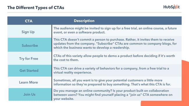
4. Use a limited number of CTAs.
When we marketers see an opportunity to reach out to and interact with our customers, we grab it with both hands. But, exercise restraint on the number of call-to-action links you add to your mobile-friendly email design.

The more the links, the more annoyed your customer will get. It’ll only confuse them. Also, your customer may close the email midway if there are too many options to click in the small space in a mobile email. In addition to this, you must always ensure that two links or CTAs have enough space between them so that the reader doesn’t end up clicking on the wrong one.
5. Avoid adding heavy image files.
By this, we don’t mean that you should add tiny images. Just don’t include high-resolution images as they will make the email heavy and require high internet speed to load. Your customers might be checking their emails in an area of low connectivity. If the images don’t load, they’ll be highly inconvenienced.
The Impact of Mobile-Friendly Email Designs
If you have not been using mobile-friendly email designs, you most definitely must be getting an increased bounce rate and lesser clicks on your emails, along with some negative reviews.
This is because your customers are facing inconvenience in their user journey. It’s high time you started optimizing your emails for mobile phone users. We are 100% sure that this will lead to improved email performance.
Here is a glimpse into how a mobile-friendly email design will impact your campaign.
1. Lesser spam and low unsubscribe rate
If your users get a chance to read your promotional content—the same one they signed up for—there will be no need to mark your emails as spam or simply unsubscribe.
Research suggests that maximum users also tend to delete emails that don’t have a mobile-responsive design. Well, of course, they do. Can you blame them?
2. Improved conversions
Once you begin creating mobile-friendly email designs, get ready to watch email become the best marketing channel for you in terms of ROI. Yes, that’s right. You will see more customers following your CTA when they can make sense of your emails from their phones. And, improved clicks mean improved sales.
3. Better brand image
If you, as a brand, keep sending emails that don’t show up properly on the user’s phone, they will get annoyed and communicate it in one way or the other. Once you begin using mobile-friendly email designs, it’ll show your users that you are a progressive brand that believes in moving forward with technology. After all, what kind of brand are you if you aren’t even improving your products and services with time?
Examples of Mobile-Friendly Email Designs
Now that we have covered the important aspects that make an email mobile-friendly, it’s time to look at some perfect examples of the same.
1. Zomato

As always, Zomato’s marketing team has been nailing this platform of communication as well. Its product is top-notch, and the audience knows that it is a progressive company. As a result, you can see how excellent and tiny their email is. And yet, the typography is on-point, and their message is received.
2. Zivame

You will always find that e-commerce brands send relatively longer emails. They usually do so to share a new product with the customer. Zivame still manages to keep it together. Their text is perfectly visible, the images aren’t too big, and the email isn’t lengthy.
3. WedMeGood

WedMeGood isn’t just an e-commerce brand. Consider it a content site that also brings together all the wedding jazz under one roof. With the amount of content they update every day, the email isn’t too lengthy. The best part is the amount of space given between the CTAs.
4. Sugar

Just like Zivame, Sugar is the perfect example of an e-commerce website that controlled itself from going overboard with links and products in its mailer.
5. MamaEarth

This is probably one of the most concise emails an e-commerce site has ever sent. It’s just making the customers aware of their sale, with a single CTA directing users to download the app. To top it off, the image is exceptionally catchy.
In Summary
Marketers who are on top of their game understand the importance of making their email campaigns mobile-friendly. If you are one of them, you would realize by now that in addition to avoiding spam filters, it is also crucial to consider how and where an email will be viewed, on which device, whether it will be relevant, and what action will the user be required to take.
Although there is no universal design template that works well across all platforms or devices, we must cater to the needs of both desktop and mobile users in a single design by employing common sense and best design strategies.
The greatest tip is to write emails that mobile consumers can read and respond to just as easily as desktop users. We hope our comprehensive guide has equipped you well to do the same.
Key Takeaways
Email formatting for mobile devices isn’t something that will be done in the future. It’s taking place right now. Although either will suffice, mobile email designs have advanced from mobile-friendliness to mobile-responsiveness.
By following these crucial points, you’ll be well on your way to successful email marketing:
● Use fewer characters and bold, clean font to simplify your format.
● Consider employing single-column layouts and a pre-header text.
● Keep your email copy concise and free of fluff.
● Hyperlinks should be used sparingly, and images should be used to attract attention.
● Pay special attention to your call-to-action buttons and links.
● Keep your subject lines small and crisp.
Even if you don’t have any coding background, you can simply adapt and learn how to send mobile-friendly emails as a proficient email marketer just by using any email marketing software. Many mobile-responsive email best practices need only minor tweaks to make things work.
FAQs
A set of mobile-friendly best practices needs to be followed to make a mobile-friendly HTML email template. While this is a very dynamic area, the following are some tips that will help you out.
○ Keep your subject lines short and crisp
○ Keep your fonts simple, bold, legible, and clean
○ Avoid using long copy ideas for your emails and overstuffing them
○ Add CTAs that will direct your users to the final product. Don’t add too many steps in their journey, as it’ll annoy them, especially when they read your email on their phones
○ Ensure that important bits such as CTAs are clearly highlighted
○ Always test your emails before sending
Emails are probably one of the most traditional methods of digital marketing. But, it still remains the medium that gives the best return on investment. Emails still have the maximum user base. Hence, it’s not surprising that brands prefer email marketing over others.
When a piece of content you see on your laptop or desktop is easily readable on your mobile screens, it’s mobile-friendly content.
If akin to most brands, you also have a mix of consumers who visit your website or read your emails on both desktop and mobile, you will need to create an email template that fits both. In such a case, 450 to 500 pixels is the answer you’ve been looking for. Average mobile readers need the email to be of about 320 pixels.
One cannot use the pinpoint of a mouse on mobile devices. So when you add multiple CTAs too close to each other, it becomes difficult for the customers to click on their desired one. You want your customers to have a seamless and convenient journey with your brand. Therefore, you must leave some space around to make accessing the CTA easier.
Latest Blogs
Explore how Google’s 2025 AI search updates triggered ranking chaos. Learn actionable strategies to adapt your SEO for AI Overviews, zero-click searches, and SERP volatility. Stay ahead now.
Learn how to rank on AI search engines like ChatGPT, Perplexity, and Gemini by optimizing your content for authority, structure, and relevance. Stay ahead in AI-driven search with this strategic guide.
Explore the best healthcare SEO services for your medical practice. Improve online visibility and effectively reach more patients in need of your services.
Get your hands on the latest news!

Similar Posts

Content Marketing
4 mins read
11 Best B2B Content Marketing Agencies for B2B Companies in 2024

Content Marketing
5 mins read
Top ecommerce Marketing Agencies with Proven Strategies for 2024

Content Marketing
5 mins read