5 Hacks to Better-Looking, Consumable Content
Sometimes, “how you present” matters more than “what you present.”
Writers may find the right words, create the most useful, never-read-before masterpiece, and yet get greeted by an unfavorable bounce rate a few days later. Writing useful content isn’t enough anymore. Presenting the information in a reader-friendly way will ensure that the thumb keeps scrolling to the end.
In an age where the human attention span is barely 8 seconds, publishing chunky text is like testing the reader’s patience. Be it a newsletter, blog, or article, the goal is to create “scan-able, bite-sized, and consumable” content that puts the intended message across without too many words.

Let’s see how!
Keep ‘em Hooked: 5 Tips to Consumable Content
Make your reader go scroll-stop-scroll-stop all the way to the conclusion.
1. Cut down the paragraphs; make them mobile-friendly
Nobody (seriously, nobody) wants to read seven lines in a row. Imagine, seven big lines loaded with adjectives, semi-colons, and jargon. These are enough for any reader to hit the “back” button and click somewhere else.
Writers forget that the readers might be reading on their phones. Eight wordy lines look like a little novella on that 6-inch screen. Be an editorial ninja. Slash those eight lines into 3-3-2 bit-sized lines. Add an image, if relevant.
2. Point it out with bullet points
“Go easy on the eyes” is the key to informing readers without boring them. And to make any content quickly consumable, put it into bullet pointers wherever possible.
Pointers always save the day, especially in the case of long-form content like guides, how-tos, and product descriptions. Summarizing each sub-topic in pointers will quickly convey the core message.
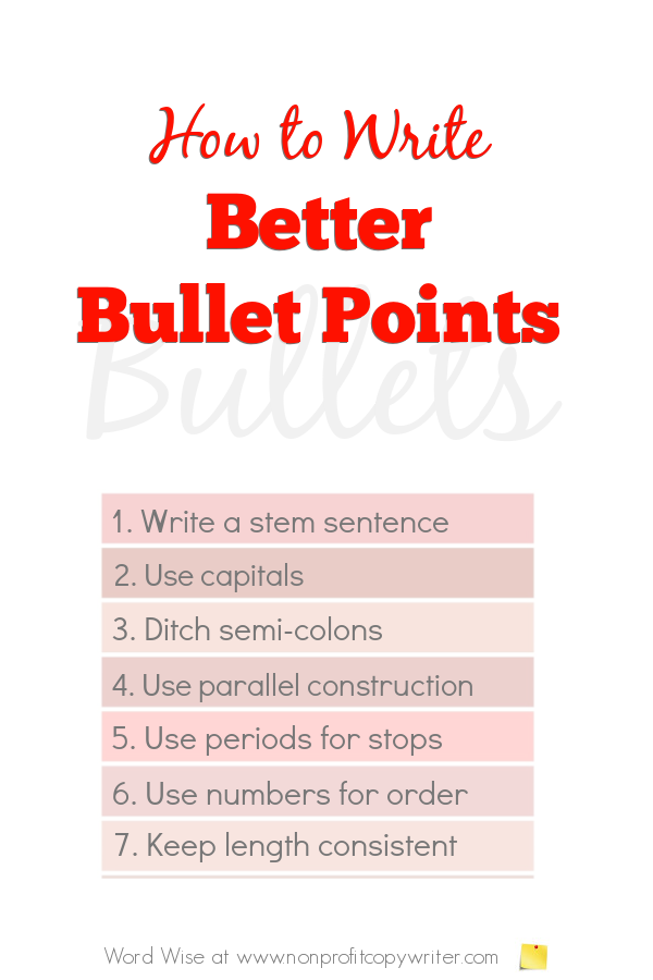
Pointers stand out from the rest of text, which makes them “scan-able.” It’s as good as saying, “Hey, the important part is right here,” but professionally.
3. Index, subheads, and bold-en letters
Nobody has the time to read everything a writer writes. Readers scroll down to the parts they want to read and leave. To make this “takeaway” easier, make your content navigable. This becomes even more significant in the case of long-form guides and how-tos.
Mention all the heads and sub-heads in an index at the top and link them to relevant sections below. Readers will click on the heading that interests them and go about their business.
If putting a “table of contents” isn’t possible, highlight important parts in the text. Don’t be shy, bold-en 3 to 4 words in each paragraph to make the content more consumable.
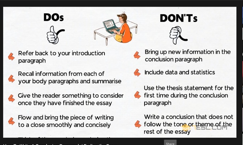
4. A conclusion is seriously underrated
Most people will tell you that the introduction is essential. But in some scenarios, the intro might be a little overrated. For instance, while reading a blog about product comparisons, people are likely to scroll down to the conclusion and read the verdict.
In this case, it’s introduction < conclusion, as they’re interested in knowing whether to buy X or Y. They’re already familiar with the products, so the intro is totally skippable.
This doesn’t mean the introduction is negligible. The entry needs to be a loud bang, but the exit must be equally loud.
5. Clickable, no-nonsense headlines
Try to stand out. But try not to sound sales-y and clickbait-y. The safest and best way to write a headline is to keep it simple and straightforward. To grab eyeballs and attract that mouse click, it needs to be fun + informative for the target audience.
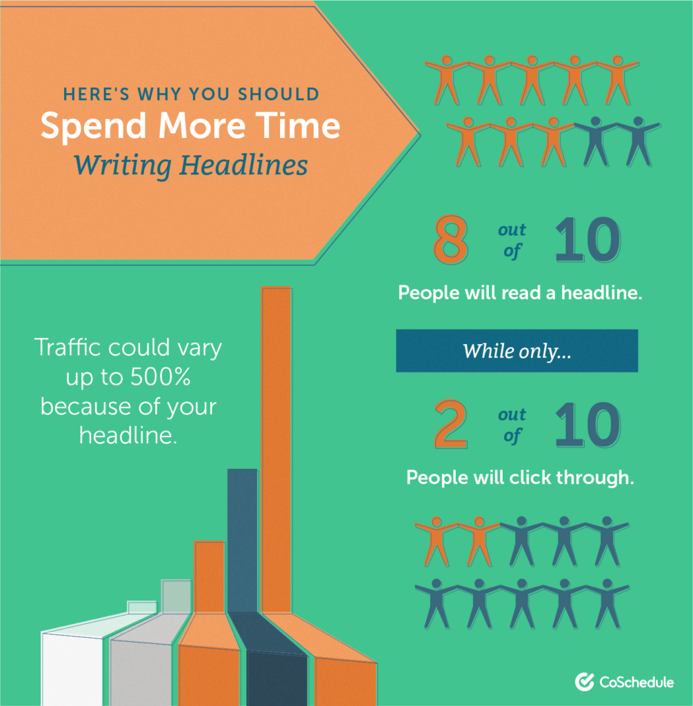
If the title of this blog was “5 Ways to Enhance the Formatting of Any Text,” readers might not even read past the first three words. But more people would be interested in “5 Hacks to Better-Looking, Consumable Content.”
Why?
Because most writers want their content to look better and be consumed. The headline already summarizes the core message and outcome of the blog. It’s clickable for the audience it was directed at.
I know we said five, but here’s a bonus tip.
6. Use relevant images
To increase your post’s reader-friendliness, use relatable images. To determine if an image fits, see if your sub-head and the image are putting the point across without the text. Countless free images are available on Unsplash, Pixabay, and similar sites.
Some teams can afford customized infographics and visuals for their blogs with a big budget. All you need is a pop-culture-obsessed copywriter to make it all relatable.
In the End
Chop the text-y chunks, highlight with bullet points, write summarizing subheads, end with an impressive conclusion, and top it all off with a click-worthy headline. And, of course, an active voice and “flowy” sentences will add a nice human, conversational touch.
Go easy on the eyes, and the readers will thank you!
Nitisha Upadhye is your Y2K kid, a pop-culture-obsessed copywriter who lives on the internet.

Latest Blogs
In this blog, explore the golden rules of using AI marketing tools so you can leverage the benefits to their maximum potential.
In this blog, you’ll learn how to avoid the pitfalls of SEO over-optimization while enhancing your site’s performance.
In this article, we’ll take a look at what AMP is, its advantages and disadvantages, and how it affects SEO.
Get your hands on the latest news!

Similar Posts
Content
9 mins read
Content Marketing vs Advertising – Which One is More Effective?
Content
11 mins read
Interactive Content vs. Static Content: Which is More Effective?
Content
6 mins read